1. Start with the work, not the palette.
Choose one common task: saving a contact, checking out equipment or recording stock usage. Write down the action that finishes it. That action should be easy to find, while secondary navigation stays quieter.
A theme supplies reusable visual styles. It does not rearrange your fields, write your scripts or decide which action matters. Those are layout and workflow decisions.
2. Give actions a clear order.
For a contact editor, make “Save contact” the strongest action, keep “Cancel” quieter and move destructive actions away from routine work. Use precise labels instead of asking users to interpret several identical buttons.
BEFORE · EQUAL EMPHASIS
Every action competes for attention; “OK” gives little context.
AFTER · ONE CLEAR NEXT STEP
Keep deletion in a separate, deliberate workflow with confirmation.
Illustrated design example, not a FileMaker screenshot or an automatic theme transformation.
3. Group fields around a task.
Place a person’s name and organization together, communication details together, and notes in their own space. Align labels and field edges. Use a consistent gap inside each group and a larger gap between groups. Check long names, empty fields and realistic notes before calling the layout finished.
4. Compare two real theme treatments.
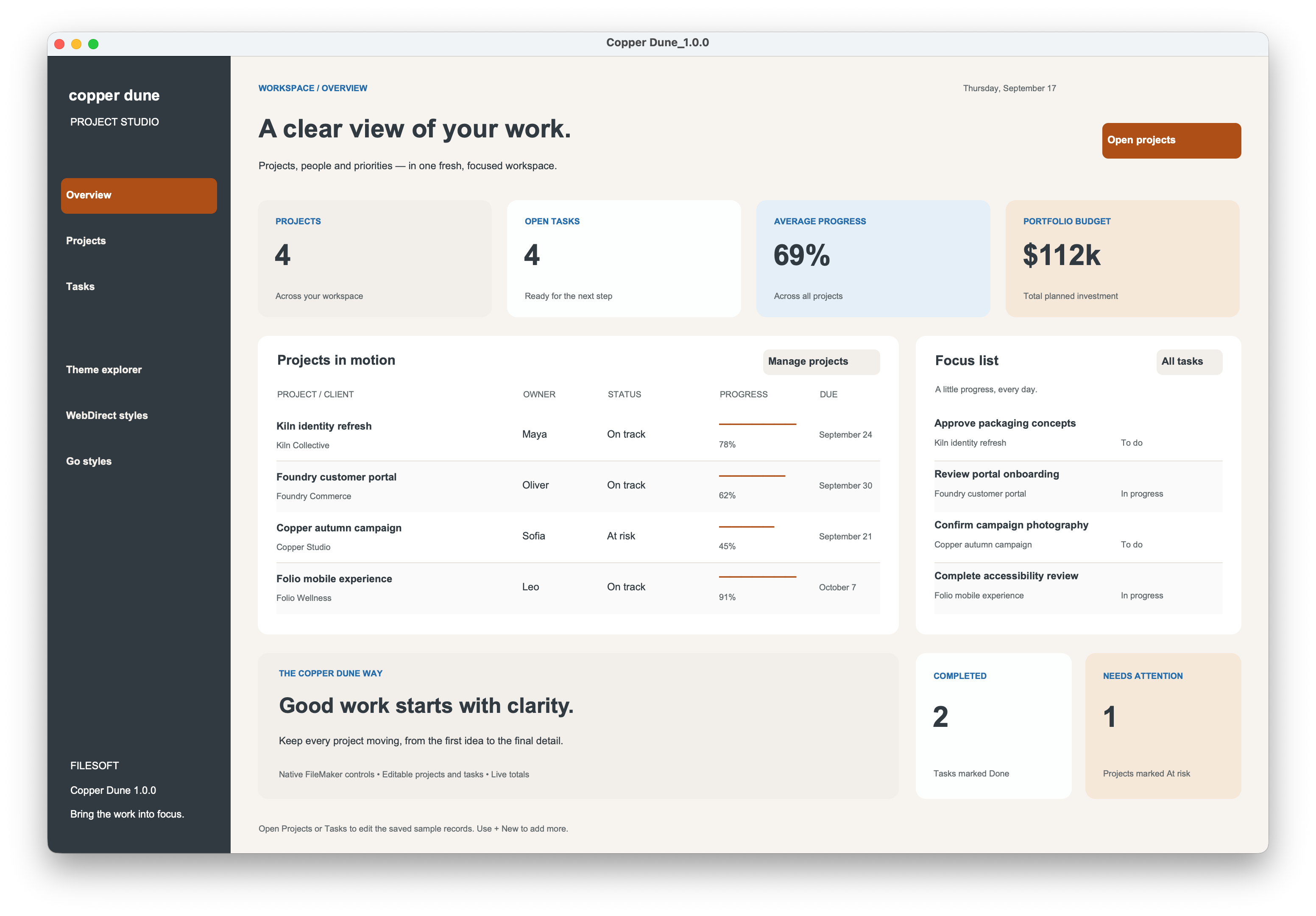
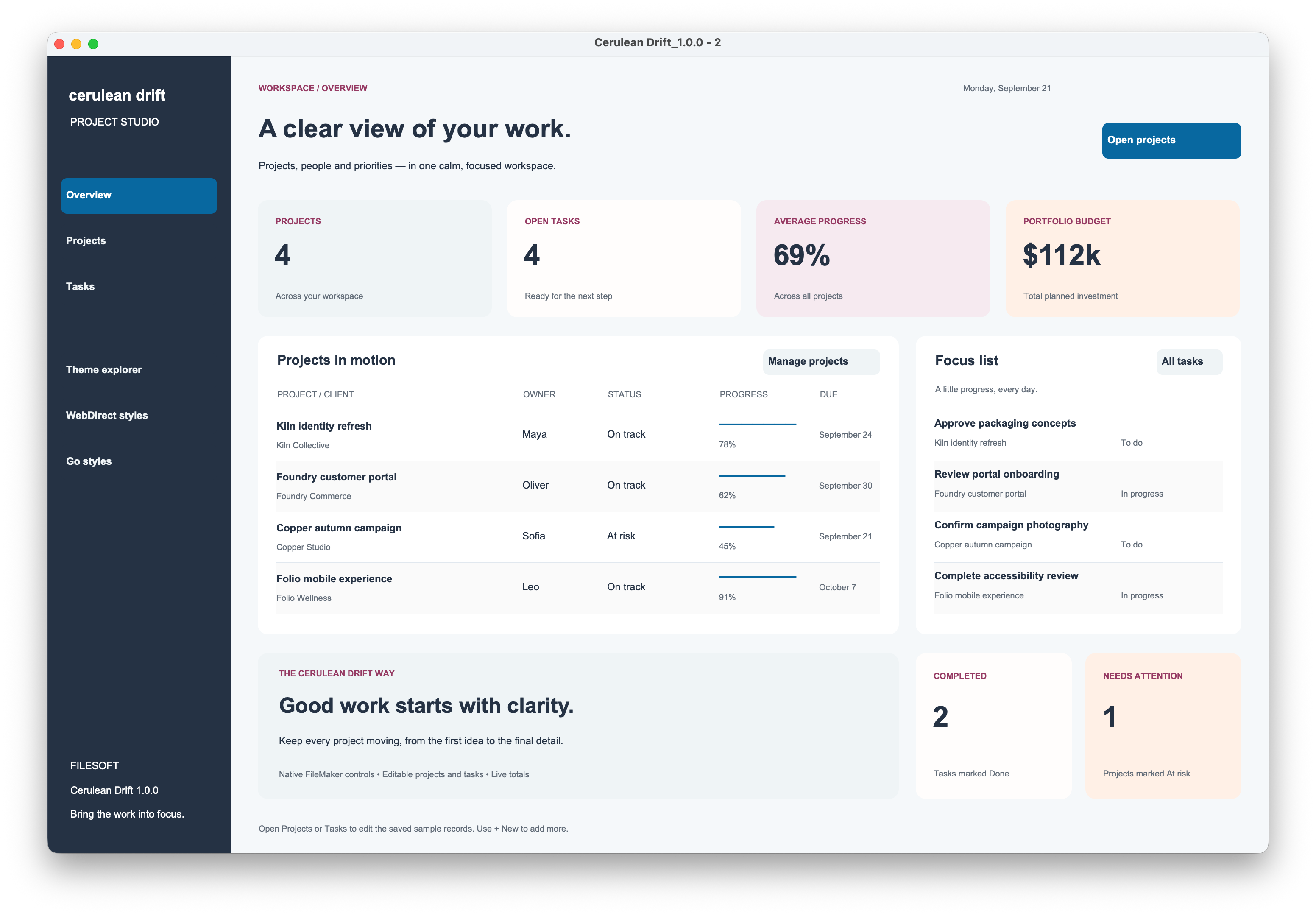
These existing FileMaker demo screenshots show Copper Dune and Cerulean Drift. Look at how their accent colors distinguish navigation and actions. They are two theme examples, not a before-and-after conversion of a customer app.
5. Make your styles reusable.
Work in a backup copy with permission to edit layouts. Select a representative button or field in Layout mode and refine its appearance in the Inspector. Save the result as a named style, then apply that style to other objects of the same type. Use names that describe a role, such as “Primary action,” rather than a color you may change later.
Saving an object’s appearance, a style on a layout and the theme are different steps. Save the style changes and then save the theme when you want those definitions available across layouts using it. Review other layouts after changing a shared definition.
When switching themes, matching style names can pick up the new theme’s definitions, while unsaved layout-level style changes can be lost. Test one representative layout first and inspect the result. Follow our theme installation and customization guide for the import workflow.
6. Check more than the normal state.
- Check field text, selected rows, focus, hover and pressed controls where applicable.
- Keep status words such as “Overdue” visible alongside color.
- Tab through the layout and make sure keyboard focus is visible.
- Try your longest labels and a narrower window. Look for clipped controls and crowded groups.
- Check Go and WebDirect separately if your app uses them. A desktop review does not validate another platform.
A small first pass.
Take one layout and identify its main action. Group its fields, choose a few named styles and test realistic records. Capture your own before-and-after screenshots using fictional data, then ask someone to complete the same task in both versions.
Spring Garden Lite is a free sample with 24 selected styles and two desktop layouts. FileMaker Pro is required. For a working business example, explore the free standalone solutions; check each product’s requirements.
FileMaker reference
For the exact behavior of theme changes, see Claris: Changing the theme of a layout. For the distinction between layout styles and theme styles, see Claris: Saving and managing layout themes. Interface labels can vary by FileMaker version.