02 / SEPARATE THE WORK
What changed, and who does it?
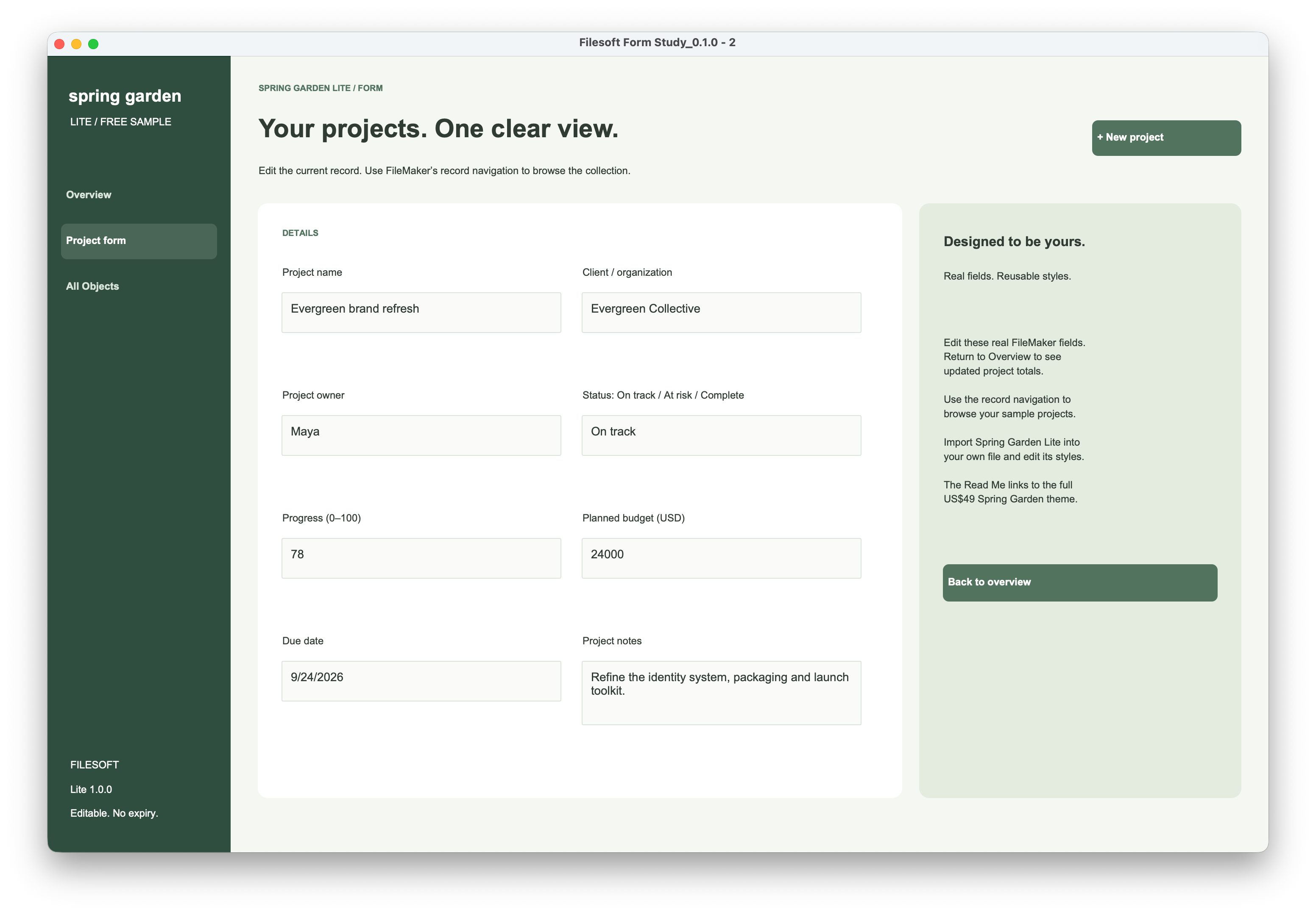
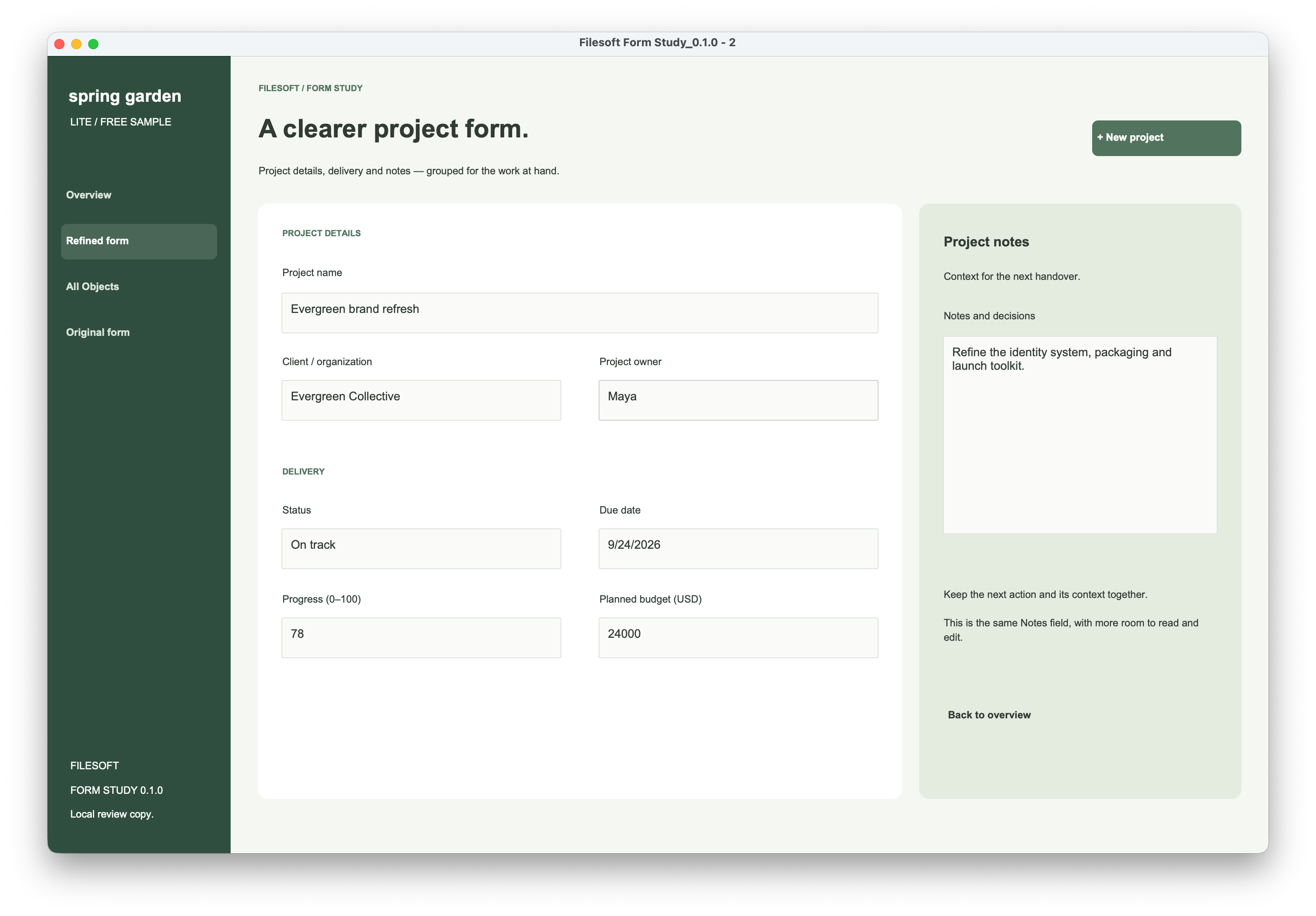
The theme supplies reusable visual styles. The layout author decides where information belongs, how much space it receives and which action deserves attention. Styling alone cannot make those decisions.
| Layer | In this example | What it means for your app |
|---|---|---|
| Theme | The existing Spring Garden Lite theme is unchanged. The return button now uses its secondary button style. | Reuse named roles for fields, labels and actions. Importing a theme does not import this layout, its records or its behavior. |
| Layout | Fields move, project name widens, notes grow, and a Delivery heading is added. | Arrange and size objects deliberately. Check long values and empty fields on a representative layout. |
| Behavior | All eight field bindings are retained. New project still uses the existing New Record/Request action; existing navigation remains, with a link back to the original form. | No new validation, save workflow or business automation was added. Review those separately. |
03 / KEEP THE STYLES REUSABLE
Make roles consistent.
The refined form uses the existing Lite field, dashboard body, eyebrow, action and secondary styles. It adds no theme CSS. A larger notes area is a geometry change; a quieter return button is a choice of named style.
When adapting this to your own file, check the style assigned to each object and inspect local overrides. If you create a reusable variation, save the style and then save the theme. Review other layouts using that theme before rolling it out. Start with the Lite styling exercise, then check how style changes propagate.
04 / REVIEW THE BEHAVIOR
The picture is only part of the review.
Keyboard order and focus: this preview retains the source input settings. It does not claim a finished keyboard flow. In FileMaker Pro, inspect Set Tab Order and test a deliberate path through project name, client, owner, status, due date, progress, budget and notes. Include relevant buttons explicitly if they belong in the keyboard workflow. Tab forward and back, and check that focus is visible. Use the keyboard review guide.
Resizing: the 1440 × 940 form retains the donor objects’ anchor settings. Moving objects does not make a desktop form responsive. Review it at the intended window sizes; a smaller window can still require scrolling. Test any later anchor changes with neighboring labels, fields and panels together. Practice layout anchors.
Display states: compare normal, hover, pressed and focus states in the native file. The XML comparison only renders normal-state styling. Review button states.
This is a desktop review example. This preview has not been validated on Windows, FileMaker Go or WebDirect; each needs its own layout and interaction review. FileMaker Pro is required and sold separately.
05 / WHAT THIS EXAMPLE SHOWS
A specific change you can inspect.
The source and refined layouts use the same table occurrence, field bindings and theme. The original three demo layouts remain unchanged in the review file. The change is inspectable, but no task-time, accessibility or conversion improvement has been measured. Both native screenshots above show the same record. Keyboard, focus, interaction and resize checks remain pending; screenshots alone do not verify them.