Choose colors for roles, not isolated swatches
A color can look attractive in a palette and become hard to read when paired with another color. A button also needs more than a default state. Start with a small set of roles—body text, surfaces, button text and focus—then check them together before styling dozens of objects.
This exercise uses the browser preview first, then a FileMaker practice layout. The preview is illustrative: its CSS and JSON exports are reference colors, not installable FileMaker themes. Its nine starting palettes are original design studies, not previews of Filesoft’s paid themes.
1. Establish a baseline
- Choose Garden study in Starting palette and apply it. Applying a palette replaces the current role colors.
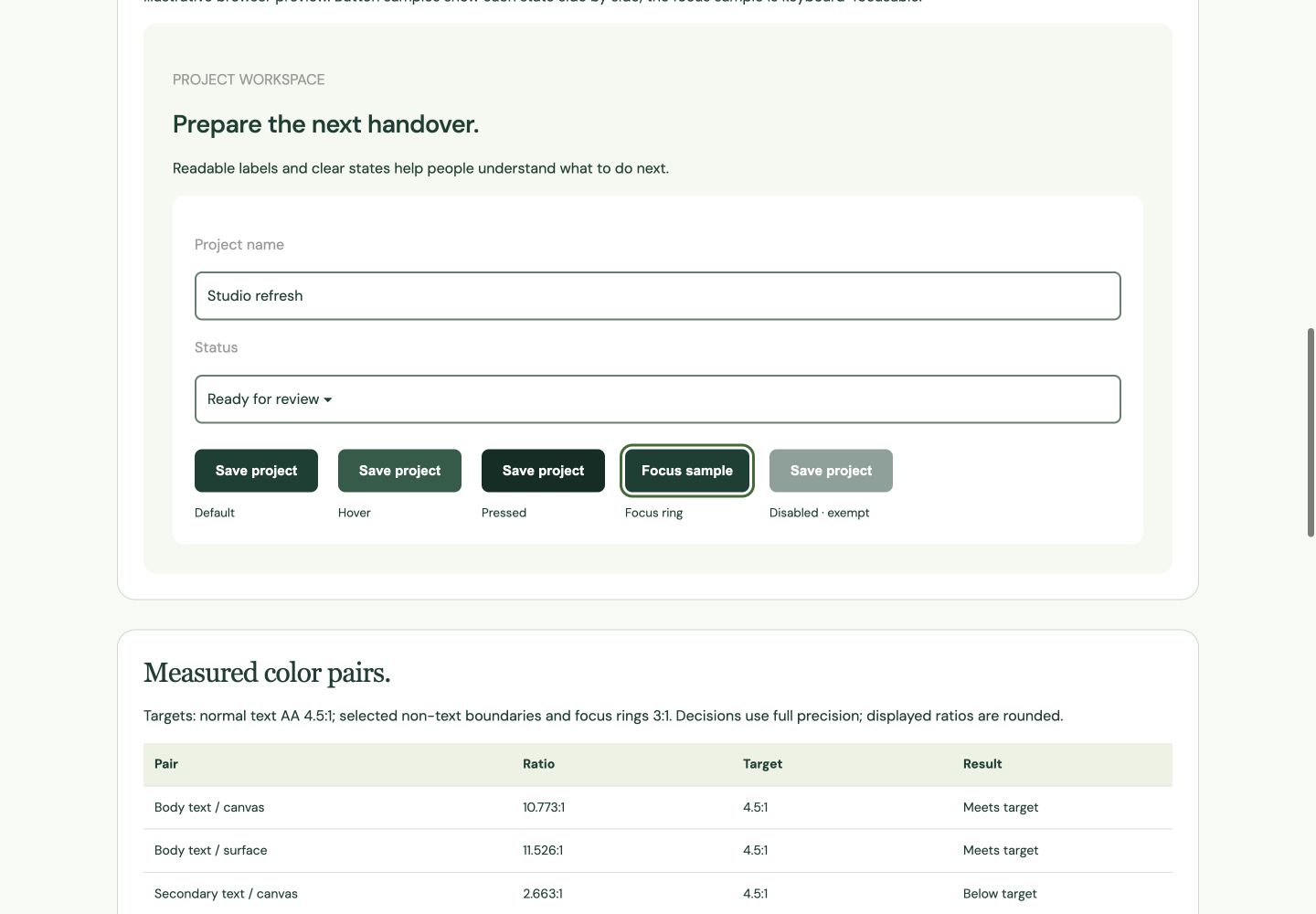
- Look at the preview’s labels, white field surface, default button, hover state, pressed state and focus ring.
- Read the measured-pair table. Keep the baseline export before experimenting so you can restore it.
The tool currently checks ten selected pairs. Passing those pairs is a useful baseline, not a certificate for your whole layout. Icons, error messages, selected rows and any other colors you add still need their own review.
2. Make a weak pair, then repair it
Set Body text to #FFFFFF while keeping Field / card surface at #FFFFFF. The text/surface ratio becomes 1:1 and the result is Below target. This is an obvious failure, but it demonstrates that a result belongs to a pair, not a color alone.
- Restore Body text to
#203F34. - Set Secondary text to
#999999. On the white surface, the displayed ratio is about 2.849:1, below the tool’s 4.5:1 normal-text target. - Try
#52695Einstead. Check both secondary text/surface and secondary text/canvas, because the two backgrounds differ.
Do not round a near-pass into a pass. The tool makes decisions using the full value even though the displayed ratio is rounded. A ratio just below 4.5 does not meet a 4.5 target.
3. Check every active button state
Button text is measured against the default, hover and pressed fills separately. A lighter hover color may weaken white text even when the default button passes. Test all three rather than choosing a hover fill only because it looks different.
- Change Hover button to a pale color, observe the button-text result, then darken it until the pair meets the intended target.
- Review the focus ring against both the field/card surface and canvas. Press Tab to reach the focus sample and inspect its position.
- Keep a visible label or other cue for actions and statuses. Color alone should not carry the meaning.
The disabled sample is shown with reduced opacity and is exempt from these contrast requirements. That exception is not a reason to make explanatory text unreadable or disable controls without telling people why.
4. Understand what the targets mean
For WCAG AA text contrast, normal text needs 4.5:1; large text uses 3:1. Large text means at least 18-point regular or 14-point bold. This tool deliberately uses the normal-text target for its text pairs. See W3C’s text-contrast guidance.
The tool uses 3:1 for its selected border and focus-ring pairs. The non-text contrast guidance concerns visual information needed to identify controls and states. These ratios do not check focus-ring area, keyboard operation or every possible adjacent color.
Only opaque sRGB hex colors are modeled here. Gradients, transparency, photographs, display differences and native rendering can change the practical result. Inspect the actual layout after transferring the colors.
5. Transfer a small, named palette
- Choose JSON palette or CSS custom properties and copy or download the values. Keep role names with the values; an unlabeled list of hex colors is easy to misuse.
- In a FileMaker working copy, style one label, one field and one button first. Use the relevant object states where supported.
- Check field contents as well as labels, including empty, active and selected situations.
- Review the intended Windows/macOS environment and, where relevant, Go or WebDirect. Browser preview results do not establish native platform testing.
Avoid applying an experiment across every shared style before this small review. Once the roles work, document their use and expand carefully. The same dark green should not mean both “primary action” and “error” without another clear distinction.
Finish with more than a passing number
- Body and secondary text remain readable on each background where they appear.
- Default, hover and pressed labels meet the intended target.
- Keyboard focus is visible and not clipped.
- Important statuses have text or symbols as well as color.
- Long labels and larger text sizes still fit.
- The native practice layout has been inspected on the platforms you intend to support.
Keep a screenshot and palette export with the review. They give the next person a concrete reference for what was checked and help prevent later color changes from quietly weakening a working design.
References
Use a practice copy and verify the result in your FileMaker version. Browser screenshots demonstrate the tool; they do not establish native FileMaker testing.